A compilation of stuff I know about drawing Asian faces and Asian culture! I feel like many “How-To-Draw” tutorials often default to European faces and are not really helpful when drawing people of other races. So I thought I’d put this together in case anyone is interested! Feel free to share this guide and shoot me questions if you have any! I’m by no means an expert, I just know a few things from drawing experience and from my own cultural background.
FUCK THIS I SPERFECT, IT SHOWS THE ARM PRONATING AND ALL THE MUSCLES SHIFTING ALONG WITH THE WRIST
IT EVEN HIGHLIGHTS THE ULNA BONE
HEY THIS IS THE ULTIMATE ANATOMY REF, FUCK THOSE MISLEADING TERRIBLE FUCKING “ANATOMY” TUTORIALS THAT GOEAS AROUND TUMBLR, THIS IS ALL OYU NEED, LOOK AT THE LATISIMUS STRETCHING OVER THE SERRATUS, THE PECTORAL MUSCLE MOVESUPWARDS AND OVER THE BICEP AND EXTENDS ALONG WITH THE ARM THERES EVEN THE CORACOBRACHIALIS;. AAAA OMFG I’M SO HAPPYYYYYY
Admin Kin here: This is one of the most helpful references in our library, but I wondered if any of our followers might be able to help identify the color coded muscles? It would be great to be able to know what is what while practicing from these sheets!
Sure, @anatomicalart! The colors get reused between the arm/back angles so I’ll separate them.
I can totally understand your frustration. We’re taught to draw thin bodies a lot more often and thoroughly than we’re taught to draw fat ones, so learning how to draw larger bodies can definitely be a struggle, even for fat artists. But I’ve rustled up some links that should hopefully prove useful to you and other artists dealing with the same problem.
Fat Drawing Tutorial:
Here’s a pretty good one that covers different fat body variations and includes larger fat girls: “Tutorial – Curves on Girls”
Once you get past the part about abs this one’s got some really good information and reference on how to draw how fat looks realistically: “Understanding Anatomy VII“ (that whole tutorial series looks to be helpful on drawing anatomy, so I recommend checking the other parts out too)
This one doesn’t cover larger fats, but it does have some good stuff about distributions of fat on the body and variations on fatness: “Varying Your Body Types”
Here’s a short, not-terribly-thorough one (that’s got some complaints in it on unrealistic depictions of fatness in fat-fetishistic art, just fyi), but which makes good points on incorporating gravity into depictions of fatness so the fat doesn’t look like balloons: “How To Draw Fat Women”
This one’s a short tutorial (that has minor problematic language) about how to draw waists that’s inclusive of smaller fat bodies. “Female Waist Tutorial”
A short tutorial about drawing hips, inclusive of smaller fat hips. Not a lot to it, but helpful to glance over. “Female Hip Tutorial”
“Drawing Fat on the Body is a video tutorial that covers some helpful advice on how to draw fat bodies building off of prior knowledge of drawing thin bodies. Doesn’t cover different types of fat bodies/fat distribution and has some other imperfections, but a decent beginner starting point. ” (contains some mild problematic language)
“How to Draw Fat Bodies” Here’s a short post with some good general tips to keep in mind when attempting to draw fat people.
Another short, general guide on drawing fat bodies, with some good example of different fat body types. “Guide to Drawing Fat Bodies”
(One of the sadder parts of finding these was sifting through different tutorials and finding ones that were teaching how to draw really inaccurate or over-simplified fat anatomy, or included really fatphobic language or commentary in the tutorial =.=)
Here’s a Site which contains lots of pictures of different women searchable by height, age, weight, etc. that looks really helpful: “My Body Gallery.com”
A site with a lot of great full-body pictures of people organized by their height and weight (referential to the bs BMI system, but still great art reference) “Cockeyed: Height / Weight”
Other Reference:
Otherwise, if you want to search for fat reference on tumblr, I’d suggest looking through tags and blogs that often contain selfies/photos of fat people, since when you’re trying to learn how fat actually looks, nothing is more accurate reference for it than the real thing.
HOWEVER, you must be respectful in your use of these tags or blogs for reference!!!! As in DO NOT draw people straight out of any photos you find and post your work unless you get permission from the subjects you’ve drawn and/or their photographers. If you do draw random people you see in the tag, then treat your drawings as practice/study and confine whatever you make to your sketchbook for your own eyes.
But I do wholly advocate looking at all sorts of images of fat people and really paying attention to all the different ways their fat manifests itself and looks, and then practicing drawing figures inspired by what you’ve observed.
(please note that some of these tags and blogs listed below may contain nudity/nsfw content:)
(If you see your blog linked to above and would rather it not be pointed to as a place to find reference of fat bodies, just let me know and I’ll take it off right away.)
Anyways, hope this helps! And if you know of, find, or make any more tutorials, references sources, etc., please do message me with the links to be added onto this post!!! I’ll update this as I find/receive more stuff to add.
(Updated: 5/31/15 with 8 new additions to the fat drawing tutorial and fat reference photo sections)
As somebody who loves drawing chubby women but doesn’t really have the anatomical confidence to do it properly these tutorials are a life saver
THANK YOU THANK YOU THANK YOU
I’ve been asking around for tutorials for this for so long! Cuz hobby artists often don’t have the time or whatever to do, like, the in-depth life study stuff so this is so helpful.
There are a few programs I use on an almost daily basis as an artist and illustrator which I find invaluable, but that seem to be unfortunately more secret than they deserve to be. Which is too bad, because they solve a lot of small workflow problems that I think a number of people would find useful!
I’ll keep this list limited to my big three, but it is organized in order of usefulness. (And incidentally of compatibility, as the latter two are Windows-only. Sorry! Please do still check out PureRef though, Mac users.)
PureRef is a program specifically designed to make it easier to view, sort, and work with your references. I actually put off downloading it initially because it seemed redundant– couldn’t I just paste the refs into my PSD files? Indeed, the only real barrier to working with PureRef is that learning the keyboard shortcuts and the clicks to move around the program takes a little while. But getting over that hump is well worth it, because it has some distinct advantages over trying to organize your refs in your actual art program.
Firstly, you’re no longer bogging down your actual PSD file with extra layers, nor having to fight with said layers at all– PureRef has no layer panel, so you never have to scramble to grab the right one. All images you paste into the program retain their original resolution data, so you can resize, rotate, crop, etc as needed without distortion. If you find yourself needing to adjust the values, color, etc of a ref image, you can just copy paste it into Photoshop, make your adjustments, and copy paste it back into PureRef.
The other great advantage is that you can toggle the program as ‘Stay On Top’ and keep it above Photoshop (or whatever else)– which was always a problem when trying to make a reference collage in a separate PSD file. I find that I just don’t look at my references as much as I should when they are on a second monitor, and this solves that problem.
I’ve used it religiously for about a year now, creating a new PureRef file for every illustration I do, as well as a few for specific characters, cultures, or settings in personal projects. As you can see in the example above, I like to sort my images into little clusters or ‘islands’ of specific content, so that I can easily scroll out to see the entire reference map, then zoom in to the relevant cluster easily.
There is one big tip I would suggest for using this program, if you have the harddrive space: As soon as you get it, turn on the ‘Embed local images in save file’ option. This will make your PureRef files bigger, but you’ll never have to deal with a ‘broken link’ if you move around the source files you originally dragged in.
This is such a simple little app that it doesn’t have a very formal name, though I think of it as ‘Work’ or ‘Work Work’ (for some reason.) It’s a timer that counts when your cursor is active in any (of up to 3) program you set it to count for, and stops counting when you change programs or idle. No starting, pausing, stopping, or forgetting to do any of those three things.
I use this one to accurately track my hours, both to inform myself and for commissions or other client work. At the end of a work session, I take the hours counted and add them to the hours I’ve already spent on that image in a spreadsheet.
I have it set to count my three art programs (Photoshop, Painter, and Manga Studio), so based on the settings I use, it doesn’t count time that I spend doing relevant work in my browser (such as looking up an email to double check character descriptions or ref hunting), so to counter that, I set the ‘Timeout’ option in it’s menu to 360. This means it will count to 360 seconds of cursor inactivity before it considers me idle and stops counting. Since it instantly stops counting if you switch to ‘non-work’ a program, I figure this extra time just about cancels out relevant time that it ignores in ‘non-work’ programs by counting an extra minute or so when I walk away from the computer to grab some water or what-have-you.
I use Carapace the least of these three, since my work doesn’t often have a need for creating perspective lines. But when there is architecture involved in something, this proves invaluable in simplifying that process.
Carapace lets you copy paste an image into it, and then drop in vanishing points and move them around to create perspective lines. (Though you’ll want to scale down your full res drawing or painting a bit to avoid lagging the program.) Like with PureRef, fighting the shortcuts is the worst part of it, though for myself it’s more of an issue in this program because I don’t use it often enough to remember them. Still, it gets the job done, and it’s easy to adjust the points to feel things out until you get them ‘right’. Then you just copy and paste the grid back into your art program and you’ve got that information to use as need be on its own layer.
Of course, using Carapace isn’t a replacement for actually knowing how perspective works– you still have to have a sense of how far apart the vanishing points should be placed to keep things feeling believable. But it sure does save you a lot of trouble once you do have that knowledge.
So, there are my big three recommendations for programs to help your art workflow. I hope people find them useful– if you do, please share so that they climb a little higher out of their unwarranted obscurity! And if you’ve got a favorite tool like this that I didn’t cover, feel free to share it in the comments. I know I’m curious to see what else is out there, too. Also, if Mac users have any suggestions for programs that fill similar functions, feel free to share there as well!
Yes. Artistic reference is why I am reblogging this.
This is why I hate it when people draw the likes of Wonder Woman or Power Girl or She-Hulk without making them muscular because ‘that’s not feminine’. Because clearly, you know, it bloody well is.
Totally reblogging for the artistic reference. Definitely.
artistic reference my ass i’m reblogging this because she’s fucking beautiful and her body is inspiring. also she so cute
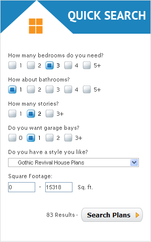
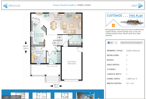
Eplans.com is a website that sells blueprints for houses.
This might not seem that helpful but if you want a characters house you can make selections based on what sort of house you want them to live in.
Then browse through the results and find the house you want. Then you can view the blueprints and have a room layout for that house, which can help with visualising the space they live in.
There are lots of ways to slow the drying process. Some people have a spray bottle full of water that they mist their paints with. Some keep them on a wet paper towel as well as misting them. There are also slow dry brands of acrylic, like “Golden Open,” that dry much slower than traditional acrylics. Experimenting with any or all of these will be very helpful to keep paint from drying prematurely 🙂