Besides The Basics (construction of heads and skulls and muscles and skeletons and how they move), I’ll go over some things I’ve been trying to work on myself lately:
1. Treat expressions as a single gesture of the face/head, as opposed to a head and then individual features dumped on a plate and arranged into an expression.
First, just get down the big shapes of your expression, just like you would for a pose.
So say I wanna do a low angle angry pose. I know the features are gonna be all mashed down at the bottom because of perspective.
Scribble it down
start to put on features
fix stuff
put on more stuff
fix stuff again
erasing and flipping and stuff a whole bunch until you are happy with it or stop caring
Whole head is a gesture!
2. Just like a facial expression, jot down where the important parts of an entire pose goes first. You can force the rest of the body to fit the pose.
So here I knew I wanted the shoulders tilted a certain direction, and te hand to be in that particular position in front of her face.
That’s the simplest explanation I got. Don’t be afraid to push and pull faces and bodies around! Worry about being “on model” last!
I’m feel really strongly about this right now and I weirdly enough think about this a lot so I’m gonna word vomit a little buuutttt
Makani is seriously like my favourite artist ever and I think when it kind of comes down to it probably had the biggest hand in teaching me how to draw?? I’ve been looking at her stuff ever since I started going on the internet when I was like 2 years old (I feel like this is common) but kind of never really thought about it aside from consuming as a fan however I guess getting into tf2 and meeting makani on the chan seriously changed how I drew entirely and it’s really bizarre to think about how such a huge factor in the way I draw today was from playing around on tf2chan LOL I feel like I never would’ve drawn characters/ interactions/ facial expressions/ etcetc if it wasn’t for that.
Anyways I guess makani has just stayed consistently impressive and incredible and I still just go look at her art like every day and start deliriously laughing because she’s so fucking good LOL Thanks for coming to my TED talk on makani
Makani is my hero. Also for those of you who ask me about expressions and body language, here’s some extremely helpful advice!
yo here’s a useful tip from your fellow art ho cynellis… use google sketchup to create a model of the room/building/town you’re trying to draw… then take a screenshot & use it as a reference! It’s simple & fun!
This is an incomplete tutorial, and it drives me crazy every
time I see it come around.
We live in a pretty great digital age and we have access to
a ton of amazing tools that artists in past generations couldn’t even dream of,
but a lot of people look at a cool trick and only learn half of the process of
using it.
Here’s the missing part of this tutorial:
How do you populate your backgrounds?
Well, here’s the answer:
If the focus is the environment, you must show a person in relation to
that environment.
The examples above are great because they show how to use the
software itself, but each one just kind of “plops” the character in front of
their finished product with no regard of the person’s relation to their
environment.
How do you fix this?
Well, here’s the simplest solution:
This is a popular trick used by professional storyboard and
comic artists alike when they’re quickly planning compositions. It’s simple and
it requires you to do some planning before you sit down to crank out that
polished, final version of your work, but it will be the difference between a background
and an environment.
Even if your draftsmanship isn’t that great (like mine),
people can be more immersed in the story you tell if you just make it feel like
there is a world that exists completely separate from the one in which they
currently reside – not just making a backdrop the characters stand in front of.
Your creations live in a unique world, and it is as much a character as
any other member of the cast. Make it as believable as they are.
This post haunts Bonka so much…hardly a day it doesnt flood her dash with notifications…it is a horrible beast of actually useful info
my advice for people wanting to draw people with freckles is think about where the sun sits- bridge of nose, top of cheeks- tops of shoulders, tops of arms and hands, collarbones generally the top of your chest
this single post is more useful to me then four years of art school
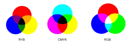
We did it in color study class on my college and it’s incredible the difference between using red/blue/yellow than cyan/magenta/yellow.
The purple was colored like shit, so as the greens. Than we tried the actuall primary colors and it FELT SO GOOD!
I JUST TESTED IT IN MY ART PROGRAM AND HOLY SHIT
IT WORKED REALLY WELL
On the left we have dissapoinment; on the right, love.
Then why do they teach us that RBY are primary colours in Pre-KG????
To mess with our heads….
Or because they think that cyan and magenta are too difficult for kids to learn? Lame either way
Reshare to save lives
Okay, no. No no no no no no no no NO.
Listen up you fucks because I’m not wasting thousands of dollars on an art degree to watch y’all fuck up basic color theory.
Red, yellow, and blue are the primary colors
If you’re using p i g m e n t.
Do you hear me? When you’re using traditional media, fucking actual goddamn paint, Bob Ross style, your primary colors are!
When you use paint, your primary colors are red yellow and blue and don’t forget it.
NOW THAT CHANGES COMPLETELY WHEN YOU GO FUCKING DIGITAL.
THE DIGITAL PRIMARY COLORS ARE RED BLUE AND GREEN IF AND ONLY IF YOUR WORK IS GOING TO STAY DIGITAL, ON THE SCREEN, AND NEVER LEAVE THE SCREEN, AND OF COURSE IF YOUR WORK IS GOING TO BE PRINTED. ON A PRINTER. WITH INK. THEN. AND O N L Y T H E N.
ARE YOUR PRIMARY COLORS.
CYAN.
MAGENTA.
AND YELLOW.
So say it with me folks!
Red yellow and blue, are the primary colors for traditional pigment that’s mostly used in paints and shit. You use red yellow and blue when you’re painting traditionally, Bob Ross style.
Red blue and green is light, which is what you’re painting with when you pick up your tablet and go digital.
CMYK is ink, and ink only. You could use cyan, magenta, and yellow as your primary colors in paint if you wanted to be a complete dick, but they’re not your primary colors unless your work is going to be printed using. i n k. The only time they could be considered the primary colors in a traditional medium is if you’re using ink.
Good day.
Also thatswhiskytoyou’s color mixing is bullshit because THIS:
Is my icon. I painted this using RED. GREEN. AND BLUE. AS MY PRIMARY COLORS and they turned out fine. Of course, I used the finger smudge tool first and then the color mixing tool and then the blur tool, but hey what do I know.
Clearly using the blur tool only doesn’t cut it.
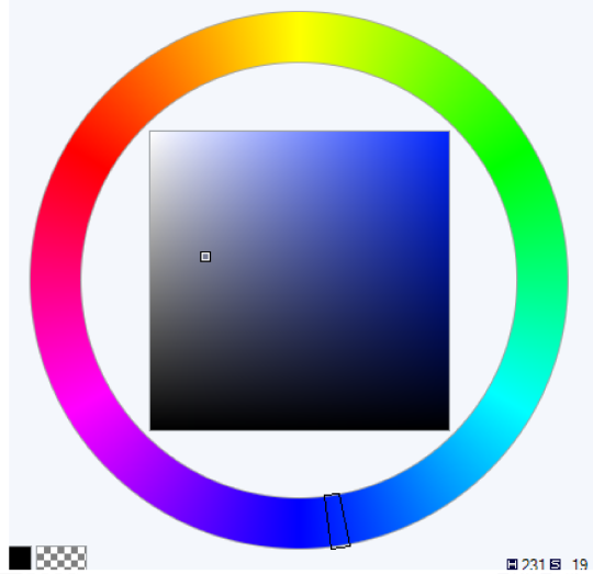
“Oh but Leo!” You say. “You used cyan and magenta in that color wheel!”
Well bitch guess what.
this is the digital color wheel. I’d say I mimicked that pretty well, don’t you think?
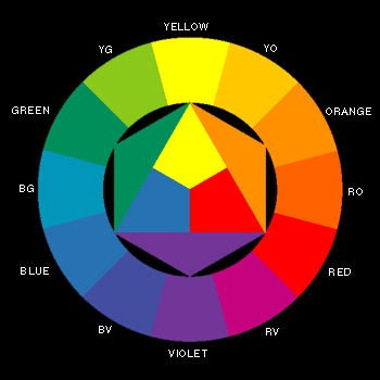
Oh and one other thing, notice how Blue and Yellow are directly opposite each other on this color wheel? That’s because we’re dealing with light, and with light, yellow and blue are complimentary colors.
Which is why when you mix them, it looks like this:
Which is a pretty neutral gray tone: They cancel each other out on the rgb color wheel when you mix them together.
BUT WITH PIGMENT THE PLACEMENT IS DIFFERENT
If you’ll notice, yellow and violet are now opposite each other, meaning they’re complimentary colors and if you mix them, they’ll make a neutral gray.
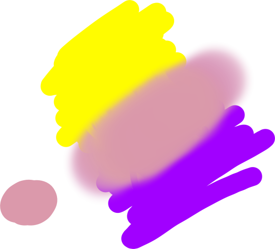
But if you mix yellow and blue, same colors as before, YOU GET THIS:
Now keep in mind that the person in the video uses a darker blue, so they get a darker green, but the point is that it doesn’t make that neutral gray.
Now what happens when we mix yellow and violet paint?
Ah yes, you get a bunch of muted colors the more evenly you mix them.
What happens when you mix yellow light and purple light?
I see, I see.
OH AND ONE MORE THING.
They didn’t teach you about red blue green and cmyk in pre-k because when most of us were in pre-k digital art was still in its early stages and what fucking seven year old knows how to use a printer.
GUESS WHO’S NOT FUCKING DONE YET:
The reason the primary colors for light are so dramatically different from the primary colors for paint and ink is because your eye only receives combinations of red light, blue light, and green light. Our eyes do not have a sensor (cone cell) for yellow light. So when we paint with light, red green and blue are our primary colors. Because of our eyes.
Furthermore, paint primary colors are colors that cannot be created by mixing other colors together. For paint, they are red yellow and blue, because you cannot mix orange and green to get yellow. Mixing orange and purple paint does not make red. And mixing green and purple paint does not make blue.
Mixing blue and green paints will make cyan. Mixing red and blue paints will make magenta.
That’s why cyan and magenta aren’t primary paint colors.
However, you can’t mix yellow and blue ink and get cyan. You can’t mix red and blue ink to get magenta.
And that’s why cyan and magenta are the primary ink colors.
Brighter and stronger paints are created through tints and shades, through a thorough understanding of color theory and a few quality paint recipes. Not by bullshit posts on tumblr designed to mislead you.
Digital painting tip brought to you from KyleBrush.com
Share with your digital art pals.
This is worth reposting since I continue to get emails from customers who have questions about transitioning from analog to digital. For me, this helps a ton.
There are lots of ways to slow the drying process. Some people have a spray bottle full of water that they mist their paints with. Some keep them on a wet paper towel as well as misting them. There are also slow dry brands of acrylic, like “Golden Open,” that dry much slower than traditional acrylics. Experimenting with any or all of these will be very helpful to keep paint from drying prematurely 🙂